as a someone with a geology background, i am fascinated by maps. when i was mapping the surface geology up in the ottawa valley (ontario), one of the unofficial overlays we produced was one showing all the key ice cream places (they were colored coded by quaility of ice cream - based on personal experience of course). you have to have your priorities right! one of these days i'll get around to posting a reflection or two on maps and what they say about the map makers and about us.
but for now, here's an interesting site that show a variety of a world maps where territories are re-sized on each map according to the subject of interest.
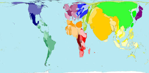
As an example, the above map, shows the
Spring 2000 world population estimates reached 6 billion; that is 6 thousand million. The distribution of the earth's population is shown in this map.
India, China and Japan appear large on the map because they have large populations. Panama, Namibia and Guinea-Bissau have small populations so are barely visible on the map.
Population is very weakly related to land area. However, Sudan which is geographically the largest country in Africa, has a smaller population than Nigeria, Egypt, Ethiopia, Democratic Republic of Congo, South Africa and Tanzania.
"Out of every 100 persons added to the population in the coming decade, 97 will live in developing countries." Hania Zlotnik, 2005
The size of each territory shows the relative proportion of the world's population living there.
2 comments:
Interesting website with a lot of resources and detailed explanations.
»
Super color scheme, I like it! Good job. Go on.
»
Post a Comment